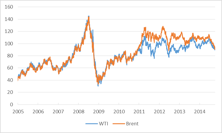
1. We can see that oil is still expensive. Brent and Crude cost around 2-times we had to pay in 2005. The doubling of the energy costs created headwinds for the global economy. The oil price jump - from $40 to a range between $80 and $120 - worked like a tax hike and reduced the amounts consumers worldwide could spend for other goods. Higher energy costs also meant higher production costs for the companies. The high oil prices since 2011 are partly the reason for the slow recovery of the global economy.
2. In the recent years Brent has been more expensive than WTI. Therefore Europe had higher energy costs than the US, which is - besides the strict austerity policy - the reason for the weak European economy.
3. Since 2011 there seems to be a cap on the price of WTI and since 2012 on the price of Brent. These caps could be (partly) explained by the climbing US oil production which lead to rising US exports onto the world market.
The recent drop of the oil prices - Brent went down more than 20% since last summer - reduced the headwinds for the global economy. Cheaper energy, especially in Europe, should foster global growth and support the recovery of Europe`s economy.
No comments:
Post a Comment